Create a field
The first thing you should do is to click on the Add Field Button.

After a new modal appears (view image below) enter all mandatory fields and select Field type.
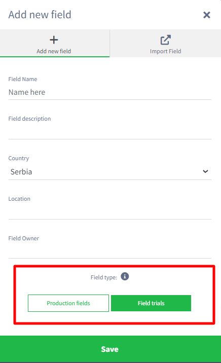
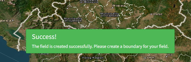
After fellfield all information, you will receive a message to create a boundary.
When user draws a Boundary, a new window will appears with two options:
- Add a map
- Request a flight
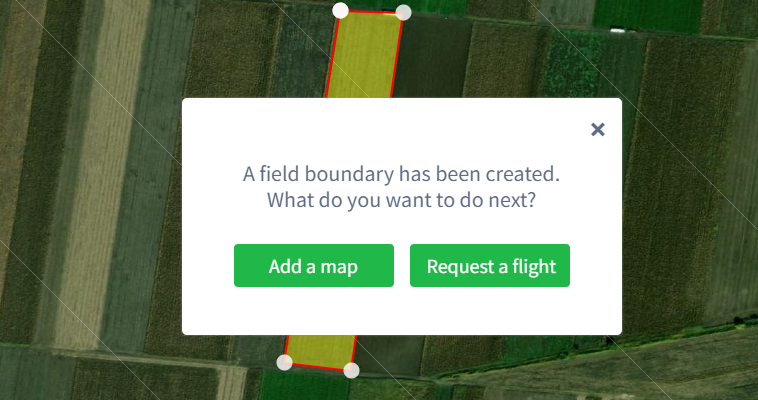
The user can choose one or the other option or click on the “X” button and thus return to the Home page.
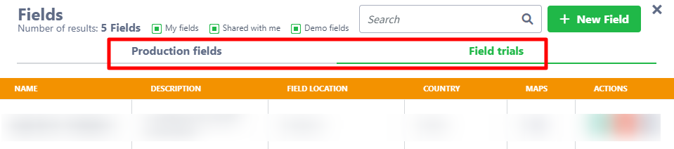
Users who have both Production and Field trials in their package can now more easily find the ones they need.
Creating Field Trials Annotations
There are two ways to create field trials annotations:
Manually create a trial
On the map where you want to add annotations, click the Area tool then Draw Polygons and Create Polygons.
A new modal appears.
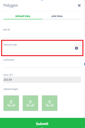
Plot ID is mandatory field and all characters are available (letter, number, special characters).
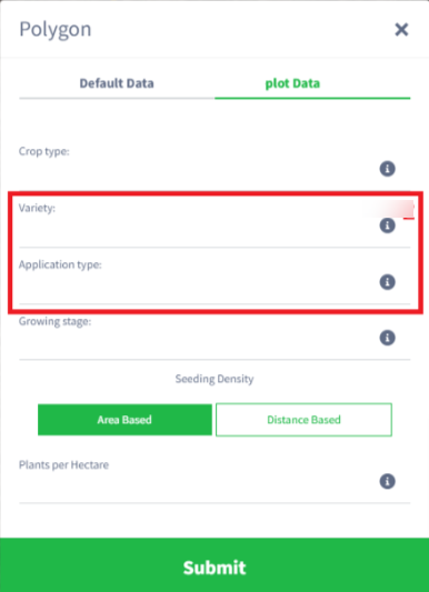
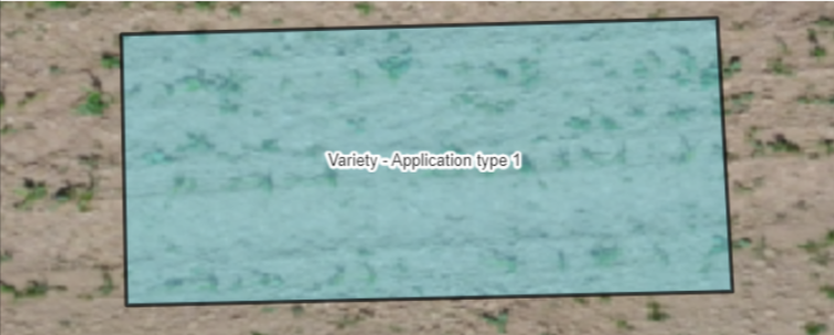
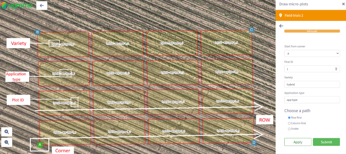
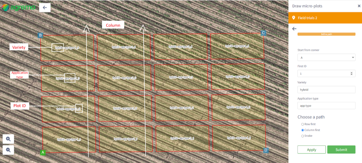
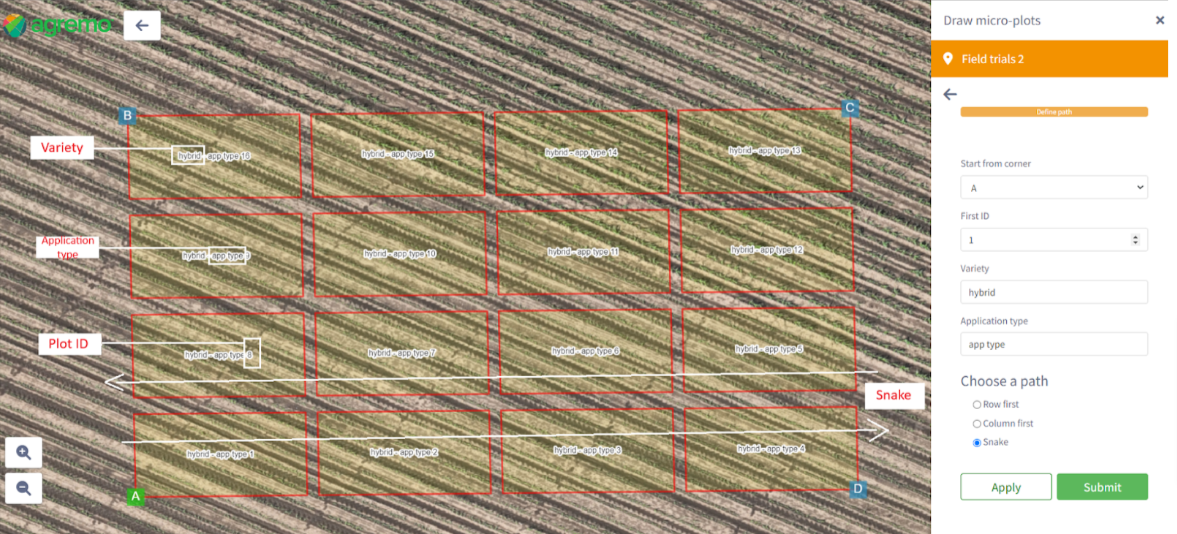
Once you click on Submit button a plot will be created and displayed on the map with a different color than the default annotations. If variety and application type are entered it will be visible next to the Plot ID on the Plot annotation (image below)
Variety should represent the type of hybrid, while Application type should represent the type of treatment applied to the particular plot.
If the user fills in these fields before requesting an analysis, there will be an option to filter the graphs by variety and/or type of application and thus see results only for the selected parameters.
External Code should represent the unique value of each plot that comes from external software (other software that users use to store information about plots, for example, ARM). Onthis way adding this field is that users can more easily match/transfer results from Agrem to their external systems
Please remember- Plot ID is a unique value.
Generate more trials
Open the Map and Access the Annotation Tool
Open the map where you want to add annotations, click on the “Area” tool, then select “Draw plots” to open the plot drawing tool.
To configure plot settings, on the right side, adjust the default settings for rows, columns, plot length, plot width, length side, width side , and rotation . All fields are mandatory and editable; changes will automatically update on the map.
Plots will appear in the middle of the map and are automatically selected. You can move or rotate the selected plots using the green arrows for dragging and rotation. For rotation, input positive numbers for left rotation and negative numbers for right rotation.
For finalize plot configuration, click “Next” to proceed to the sidebar page.
Adjust the “Start from corner” (default: point A), “First ID” (default: 1), and path (default: Row first). Apply changes to see them on the map.
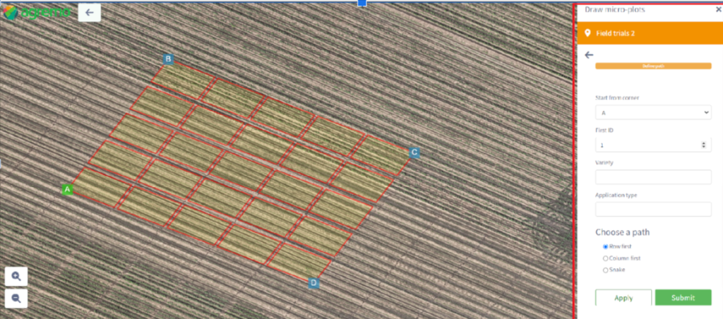
Click the “Submit” button to create the plots. The drawing tool will close, and a success message (“Successfully created annotation“) will appear.
While the drawing tool is open, you can use the left-side functions for zooming in/out, measuring distance, and a back arrow for navigation.
This manual provides a streamlined process for efficiently adding and editing plot annotations on your map.
This tool provides a flexible and visual way to add and manipulate plot layouts on a map, with real-time updates as you make adjustments.
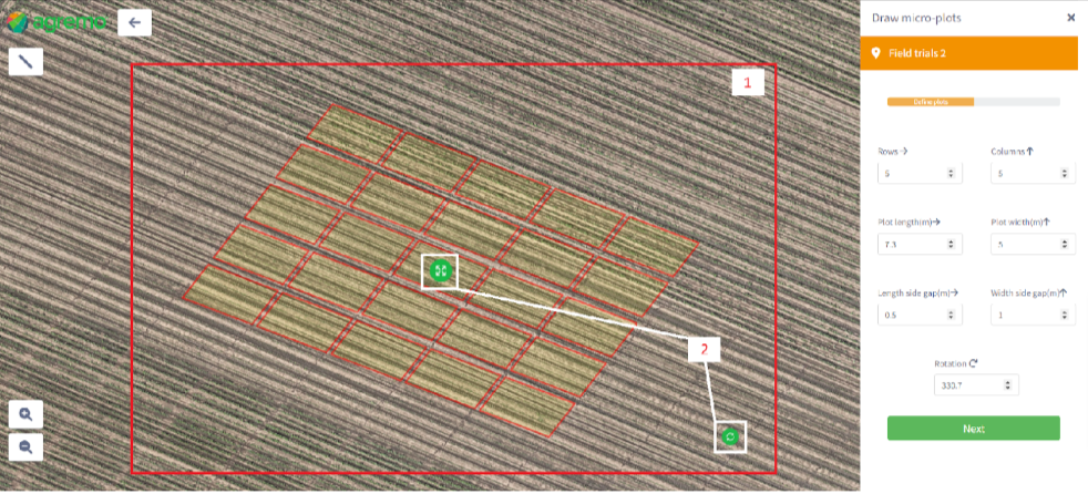
When working with dozens of micro-plots, generating them would be quicker than drawing them manually. The draw micro-plots option will open the right sidebar where you simply need to change the width and the length of plots as well as the width and the length of gaps between the plots. Furthermore, you can change the number of rows and columns or keep the default values.
There are two ways to rotate the plots, either with the Rotation drop-down option in the right sidebar or by clicking on the micro-plots which activates the green rotate button as shown on the image above.
You will probably need to move the plots in one direction or another and that is possible if you click anywhere in the micro-plots area and then on the move button, as shown in the image above.
The next step would be to choose the corner from where the plots will be counted and the way how they will be marked (row first, column first, snake). When you submit the changes the micro-plots will be generated on the map.
Importing field trials (SHP or KLM file)
- Open the Map:
- Begin by opening the map where you want to add annotations.
- Access the Import Feature:
- Click on the “Area” tool located within the map interface.
- Select “Import annotation” to proceed with importing your file.
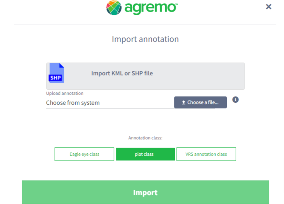
- Import SHP/KML File:
- A new window (as indicated by “image 10”) will appear for the import process.
- Click on “Import SHP/KML file” to choose the file you wish to import.
- Navigate to and select a zipped folder that contains your SHP or KML file.
- Select Plot Class:
- Click on the “Plot class” button to define the classification of your plot.
- Initiate Import:
- Click on the “Import” button to start the importing process.
- Completion and Confirmation:
- Once the import is complete, the plots from your SHP/KML file will be displayed on the map.
- A confirmation message will appear: “Success! Successfully created annotation.”
Import SHP/KML via public link
- Open the Map:
- Start by opening the map where you intend to add annotations.
- Access Annotation Import Tool:
- Click on the “Area” tool within the map interface.
- Select “Import annotation” to begin the import process.
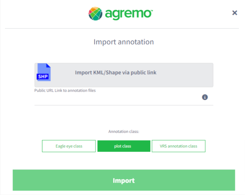
- Initiate Import via Public Link:
- A new window will pop up (picture below).
- Click on “Import SHP/KML via public link” to proceed.
- Select Your File:
- Choose the SHP/KML file you wish to import. This will typically involve pasting a public link to the file location.
- Configure Plot Class:
- Click on the “Plot class” button to categorize your plot appropriately.
- Complete the Import Process:
- Click on the “Import” button to start importing your selected file.
- Confirmation of Import:
- After the import process is complete, the plots will be displayed on the map.
- A confirmation message will be shown: “Success! Successfully created annotation.”
Selecting Plots
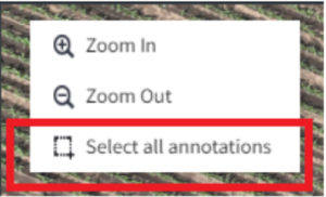
More Plots can be selected in 3 ways:
- Multiple selection tool
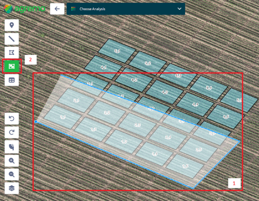
2. Select all polygons
3. Selecting with Shift button on the keyboard
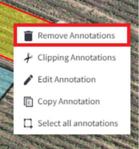
Deleting plots
- Right-Click on the created plot
- Select “Remove Annotation”: From the context menu that appears, choose the “Remove Annotation” option.
- Confirm Deletion: In the confirmation modal, you’ll see the question, “Are you sure you want to delete selected annotations?” To proceed with the deletion, click on the “Yes” button.
- Success Message: Once the annotation has been successfully deleted, the plot will update in real-time to reflect this change. Additionally, a success message will appear on your screen, stating, “Success! Successfully deleted annotations.”
By following these steps, you can easily manage the annotations on your plots, ensuring that your data visualization remains clear and accurate.
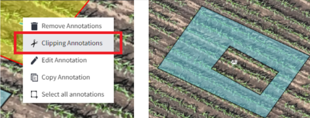
Clipping Annotations
- Right-Click on the Plot: Navigate to the plot containing the annotation you wish to clip. Right-click directly on the annotation.
- Select “Clipping Annotation”: From the menu, choose the “Clipping Annotation” option. An informational message will appear: “Info! Please select the area which you want to exclude.”
- Draw a Polygon: Your cursor will change to a point, indicating that you can now draw a polygon. Click to create the starting point of your polygon, and continue clicking to draw the edges of the shape. Close the polygon by clicking on the starting point again.
- Success Message: Once you’ve finished drawing the polygon and it’s processed, a success message will appear: “Success! Successfully clipped annotations.”
Note: Cutting annotations serve to cut those parts that are not needed for the analysis, such as in the case of Field trials: thinning, mechanical damage from mechanization, in the case of corn, excluding male corns, etc.
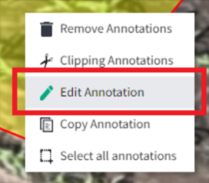
Editing plot
Edit entered plot data manually
- Right-Click on the Plot: Navigate to the plot containing the annotation you wish to edit. Right-click directly on the annotation.
- Select “Edit Annotation”: From the context menu, choose the “Edit Annotation” option. A modal will appear containing the previously entered parameters for the annotation.
- Enter New Values: In the modal, update the fields with the new values you wish to apply to the annotation.
- Confirm Changes: Once you have entered the new values, the plot will be updated in real-time to reflect the changes. You can edit the parameters one by one as needed.
- Success Message: After the annotation has been successfully edited, a success message will appear: “Success! Successfully edited annotations.”
Edit entered plots data via CSV file
- Click on “Edit Plot Data”: Find the “Edit Plot Data” button and click on it. A drop-down list will appear.
- Select “Export Data”: From the drop-down list, click on the “Export Data” option. A CSV file containing the plot data will be downloaded to your computer.
- Click on “Import”: In the “Edit Plot Data” drop-down list, click on the “Import” option. A new modal will appear prompting you to upload a CSV file.
- Upload CSV File: In the modal, click on the upload area or drag and drop your CSV file to upload the new plot data.
- Success Message: Once the file is uploaded and the data is successfully imported, a message will appear: “Success! Plot data imported successfully!”
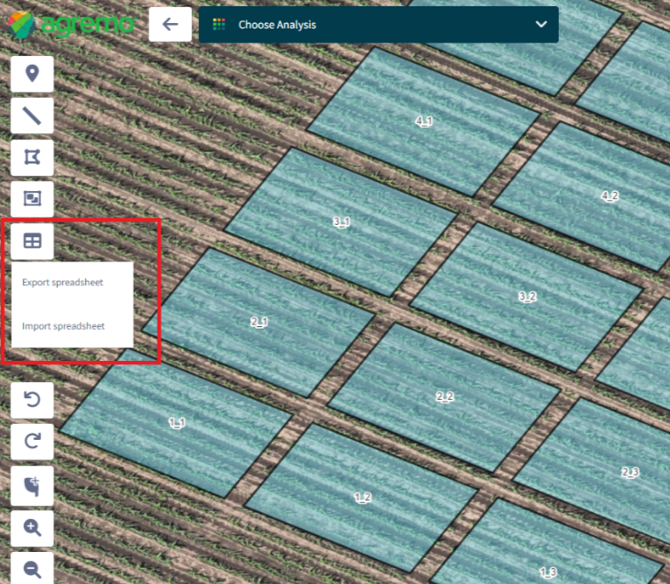
Availability of the Export/Import Button
- The export/import button will only be available if the user has enabled plot analysis in their package.
Exporting Data
- The export function is only available if at least one plot annotation has been created.
- If the user attempts to export data without any plot annotations, a warning message will appear: “Warning! You need to create plot annotations.”
- When exporting data to a CSV file, the data will be formatted with each column separated for clarity.
- The exported Excel file will contain all relevant plot data, including: Plot ID, External Code, Annotation Comment, Crop, Variety, Application Type, Growing Stage, Applied Rate, Applied Unit, Plants Distance Rate, Plants Distance Unit, Rows Distance Rate, Rows Distance Unit, and a reference number (Ref. No.) from the Agremo system.
- The Ref. No. column should remain unchanged. If a user modifies values in this column and imports the CSV, a warning message will appear.
- The unit columns will be filled by default based on the metric system set as part of the order.
- If the user exports data without selecting specific plots, the CSV will contain data from all created plot annotations.
- If the user selects a certain number of plots before clicking the Export button, only the selected plots will be included in the CSV.
Importing Data
- When importing data, ensure that the CSV format matches the accepted structure. An info tooltip in the import module will provide details on the accepted format.
- If a user imports a CSV with duplicate Plot IDs or a Plot ID that already exists on the map, the plots with the same ID will receive a suffix (1) to differentiate them.
- After importing data and receiving the “Success! Plot data imported successfully!” message, all changes should be visible immediately.
Edit plot size
- Select Multiple Plots: Hold down the
Shiftkey to enable multiple selection. Click on the plots you wish to modify, or use the multiple selection tools to select a group of plots. You can also use the “Select All” option to select all plots on the map. - Change Plot Size: Once you have selected the plots, change the size using the available size adjustment tool. The size change will be applied automatically to all marked plots.
Moving Marked Plots
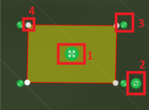
- Once plots are marked (as described in previous sections), they can be moved in any direction. Click and drag the selected plots to the desired location on the map (1).
Rotating Marked Plots
- Marked plots can also be rotated. Click and drag the rotation handle (usually indicated by a circular arrow) to rotate the selected plots to the desired orientation (2).
Centralized Control for Multiple Selections
- If multiple plots are selected, the move and rotate controls will always be displayed at the center of the screen, providing a centralized point for manipulation.
Scaling Plots
- The scaling arrow allows for resizing the plot in two ways (3):
- Uniform Scaling: Click and drag the scaling arrow to increase or decrease the size of the plot equally on all sides.
- Directional Scaling: Hold the
CTRLkey while clicking and dragging the scaling arrow to expand the plot only in the direction in which the arrow is moved.
Editing through Marked Points
- The marked plot can be edited through the marked point, allowing for precise adjustments to the plot’s shape or position (4).

By utilizing these features, you can efficiently manipulate the size, position, and orientation of their marked plots to best fit their needs.
Copying plots
Copy plots on the same map
To duplicate plot annotations and their associated data, follow these steps:
- Create a Plot Annotation: First, create a plot annotation on your map.
- Copy the Annotation: Right-click on the annotation you wish to copy. A new pop-up menu will appear. Click on “Copy annotation”.
- Paste the Annotation: Right-click on the location where you want to paste the copied annotation. A new pop-up menu will appear. Click on “Paste annotations”.
- Annotation Copied: The annotation will be copied to the location where the cursor is placed, along with all data related to the plot.
- Success Message: A message will appear confirming the action: “Success! Successfully pasted selected annotations! Pasted 1 annotation.”
Note: If multiple annotations are selected and copied (e.g., 5 annotations), the success message will reflect the number of annotations pasted: “Success! Successfully pasted selected annotations! Pasted 5 annotations.”
Copy plots on the other map
To duplicate plot annotations and their associated data across different maps within the same field and geographic location, follow these steps:
- Create a Plot Annotation: First, create a plot annotation on your initial map.
- Copy the Annotation: Right-click on the annotation you wish to copy. A new pop-up menu will appear. Click on “Copy annotation.”
- Navigate to Another Map: Click on the back button to exit the current map. Open another map within the same field that shares the same geographic location.
- Paste the Annotation: Once the new map is open, right-click on the location where you want to paste the copied annotation. A new pop-up menu will appear. Click on “Paste annotations.”
- Annotation Copied: The annotation will be copied to the same relative location as the initial one, along with all data related to the plot.
- Success Message: A message will appear confirming the action: “Success! Successfully pasted selected annotations! Pasted 1 annotation.”
Rules
- Same Field Requirement: Annotations can only be copied to another map if that map is within the same field as the initial one.
- GEO Location Matching: Both the source and destination maps must share the same GEO location coordinates to ensure accurate placement of annotations.
- Warning for Different Fields: Attempting to paste an annotation onto a map from a different field or with a different GEO location will result in a warning: “Warning! 1 annotations not from the same field. These annotations are skipped.”
- Multiple Annotations Handling: If multiple annotations are selected and copied (e.g., 5 annotations), the success message will reflect the total number pasted: “Success! Successfully pasted selected annotations! Pasted 5 annotations.”
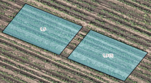
- Suffix for Copied Annotations: Copied annotations will receive a suffix next to the Plot ID to distinguish them from the original annotations .
- Location Specifics for Pasting:
- Within the same map: The copied annotation is placed where the cursor is located.
- Across different maps: The annotation is copied to the exact relative location as it appeared on the original map, maintaining its spatial integrity.
By adhering to these steps and rules, users can effectively manage and replicate plot annotations across different maps within the same field, ensuring data consistency and accuracy.
Undo/Redo
To facilitate a more flexible and user-friendly experience when working with map annotations, our platform includes undo and redo buttons with the following rules:
- Applicability: The undo and redo buttons apply to various actions, including drawing, deleting, moving, or transforming any single or multiple annotations on the map.
- Activation: These buttons become active when any of the mentioned actions have been performed on the map. This allows users to easily revert or reapply changes as needed.
- Change History: When a user leaves the map, all change history is deleted, and the actions performed on the map become permanent. It’s important to ensure that all desired changes are finalized before navigating away from the map.
How to Submit an Agremo Analysis for Selected Plots
- Open the Map: Navigate to the map where your plots are located.
- Select Plots: Click on the plot you want to analyze or select multiple plots by clicking and dragging over them or using the shift key for individual selections. Selected plot annotations will turn yellow.
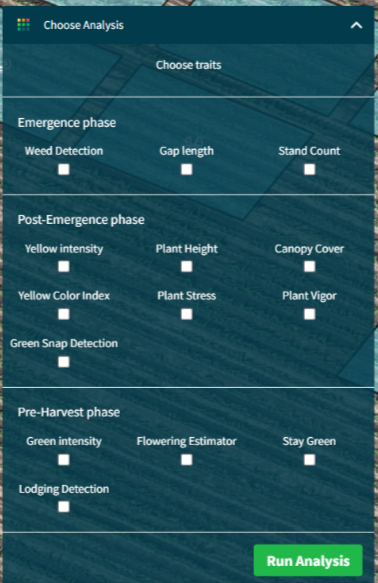
- Choose Analysis: Click on the “Choose analysis” field. A drop-down list will appear with all available analyses, which are based on the parameterization in the package for the particular client.
- Select Analyses: Choose one or more analyses from the drop-down list.
- Request Analysis: A modal will appear for requesting analysis. Enter all necessary data in the mandatory fields.
- Enter Seeding Density: Seeding Density can be added in two ways:
- Tab Area Based: Enter the number of plants per hectare.
- Tab Distance Based: Enter the distance between plants and the distance between rows.
- Apply Data: Click on “Apply to all” to apply the data to all selected plots, or “Apply to missing” to apply only to plots missing this data.
- Run Analysis: Click on the “Run analysis” button to submit your analysis request.
- Success Message: A message will appear confirming the submission: “Success! Your Agremo
Rules for Requesting Agremo Analysis Traits
When requesting Agremo Analysis for your plots, the following rules apply:
- Trait Categories: All traits are divided into three categories:
- Emergence Phase: Traits relevant to the early stages of crop development.
- Post-Emergence Phase: Traits relevant to the growth and development stages following emergence.
- Pre-Harvest Phase: Traits relevant to the final stages of crop development leading up to harvest.
These categories serve as recommendations for which traits to request based on the crop’s growth stage, but they are not a requirement for requesting an analysis.
- Seeding Density Visibility: If the user selects “Stand Count” and/or “Gap Length” on the analysis request modal, the “Seeding Density” field will be displayed. If these two traits are not selected, the “Seeding Density” field will not be displayed.
- Dependent Traits:
- Yellow Color Index and Yellow Intensity: These traits are dependent. When the user marks one of these two traits, the other one will be marked automatically.
- Stay Green and Green Intensity: These traits are dependent. When the user marks one of these two traits, the other one will be marked automatically.
- Plant Height Trait: If the user does not have a Digital Elevation Model (DEM) loaded, the “Plant Height” trait will be visible in the list but will be disabled. The user will not be able to request an analysis for this trait without a DEM model.
Requesting Agremo Analysis for Plots with Data
To request analysis for plots with pre-entered data, follow these steps:
- Open the Map: Navigate to the map where your plots are located.
- Select Plots: Click on the plot(s) for which analysis is needed. Selected plot annotations will turn yellow.
- Choose Analysis: Click on the “Choose analysis” field (image 21). A drop-down list will appear with all available analyses, which are based on the parameterization in the package for the particular client.
- Select Analyses: Choose one or more analyses from the drop-down list.
- Request Analysis Modal: A modal for requesting analysis will appear.
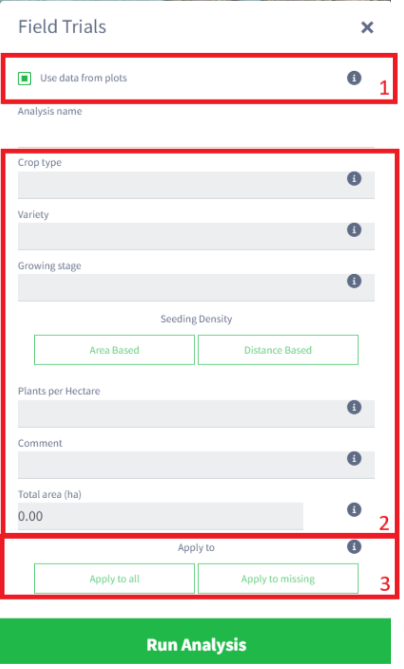
- Use Data from Plots:
- If all data is entered (Plot ID, crop type, growing stage, variety, seeding density, comments), the “Use data from the plots” checkbox will be marked (image below 1).
- If the checkbox is selected, all fields (except Analysis name) will be gray and disabled (image below 2).
- If the user does not want to use the previously entered data, the checkbox can be unchecked.
- If plots do not have these data, the checkbox will be disabled.
- Apply Data:
- Click on “Apply to all” to apply the entered data to all plots (image below 3).
- Click on “Apply to missing” to apply the entered data only to plots where data is missing.
- Run Analysis: Click on the “Run analysis” button to submit your analysis request.
- Success Message: A message will appear confirming the submission: “Success! Your Agremo Analysis is successfully submitted!”
Rules for Requesting Analysis
- Map Boundaries: If the user requests analysis for plots where annotations are outside of the map, a warning message will appear: “Warning! The selected polygons are outside of map boundaries. Please, only select polygons within map boundaries.”
- Maximum Allowed Area: If the user requests analysis for an annotation larger than approved through the package, a warning message will appear: “Warning! 1 plot(s) exceeded the maximum allowed area of 140.0 m2. Please upgrade the package or contact support.”
- Minimum Job Requirement: If the user requests analysis for fewer plots than the minimum job defined in the package, a warning message will appear: “You have selected %s plots which is less than the minimum job for this analysis type. Your account will be charged for %s plots.”
Analyzing Results
Rules:
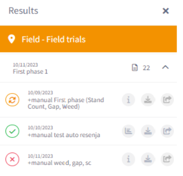
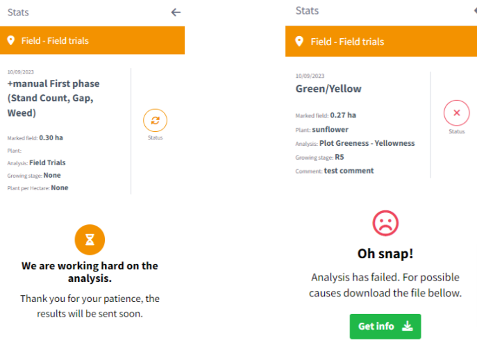
- Analysis can have 3 statuses: Finished, In Progress, and Failed.
- If all traits are in “In Progress” or “Failed” status, their icons will be visible.
- Clicking on the “In Progress” icon will display a new view on the Stats panel.
- Clicking on the “Failed” icon will display a new view on the Stats panel.
- If only one trait has the status “Finished,” the icon for “Finished” status will be visible, and the user will be able to open the results.
- An email notification will be sent to the user when all traits are completed.
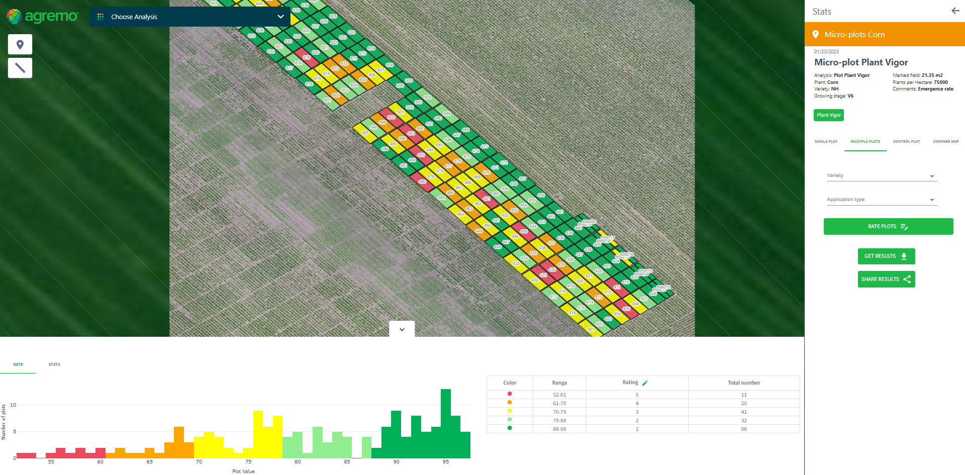
Multiple Plot View
Steps to Reproduce
- Click on “Show analysis result” on the Result panel.
- The “Multiple Plot” tab will be opened by default.
- On the Stats panel, the following will be visible:
- Data entered during requesting analysis.
- All requested traits.
- Filters: Variety and Application type.
- Rate button.
- “Get results” and “Share results” buttons.
- On the Bottom line Stats, 2 tabs are displayed:
- “Rate” with a histogram and a table.
- “Stats” with a Point graph and statistical data.
- On the map, results are presented as one plot – one color.
Rules for Traits:
- Green color represents finished traits.
- Dark green indicates the trait is turned on.
- Orange color represents traits in progress status.
- Clicking on traits in progress status will display a new view on the Stats panel.
- Red color represents traits in Failed status.
- Clicking on traits in Failed status will display a new view on the Stats panel.
- When switching from one trait to another, all included filters/actions should be on; only the results change based on the selected trait.
Rules for Bottom Line Stats:
- The “Rate” tab displays a histogram and a table. The histogram features two values:
- X-axis: Plot Value.
- Y-axis: Number of plots.
Agremo results for each plot determine the values displayed and their classification into ranges. When you hover over each bin on the histogram, a tooltip appears showing the plot value and the number of plots with that value. Clicking on a point in the Point chart takes you to the Single Plot view of the selected plot.
The table includes four columns: Color, Range, Rate, and Total number. By default, the Rate column shows the ratings given by Agremo, evenly distributed based on the obtained results. The values on the histogram, table, and map should match.
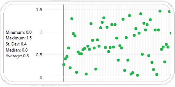
The “Stats” tab presents Statistical data and a Point chart. The left side displays statistical data, including minimum, maximum, standard deviation, median, and average values. The Point chart features two values:
- X-axis: Plot Sequence.
- Y-axis: Plot Value.
Each point on the chart represents one plot. Hovering over a point reveals a tooltip displaying the Plot ID, the value obtained from Agremo results, Variety, and Application type. Clicking on a point zooms in on the selected plot. By clicking the arrow in the middle, you can raise or lower the Bottom line Stats.
Note: The purpose of the Rate tab is for the user to see the general picture of the field and how the values are distributed. If filters are included, you will be able to see the general picture for the selected criteria. The purpose of the Stats tab is to see the uniformity of the entire field or the uniformity for a selected Variety and/or Application type. By clicking on the points that are visible in the Point chart, you will be able to check the value for the plots that “pop up” and deviate from the expected standard.
Rules for Filters: Variety and Application Type
- By default, filters will be empty.
- If a user entered values for Variety and/or Application type before requesting analysis, values will be visible on the drop-down list.
- Users can choose Variety or Application type but also can select values from both drop-down lists.
- When the user selects some values from drop-down lists, results on the map and Bottom line Stats should be changed based on the selected values.
- On the map, the plots that have the value of the selected filter will be in focus (image 27_3).
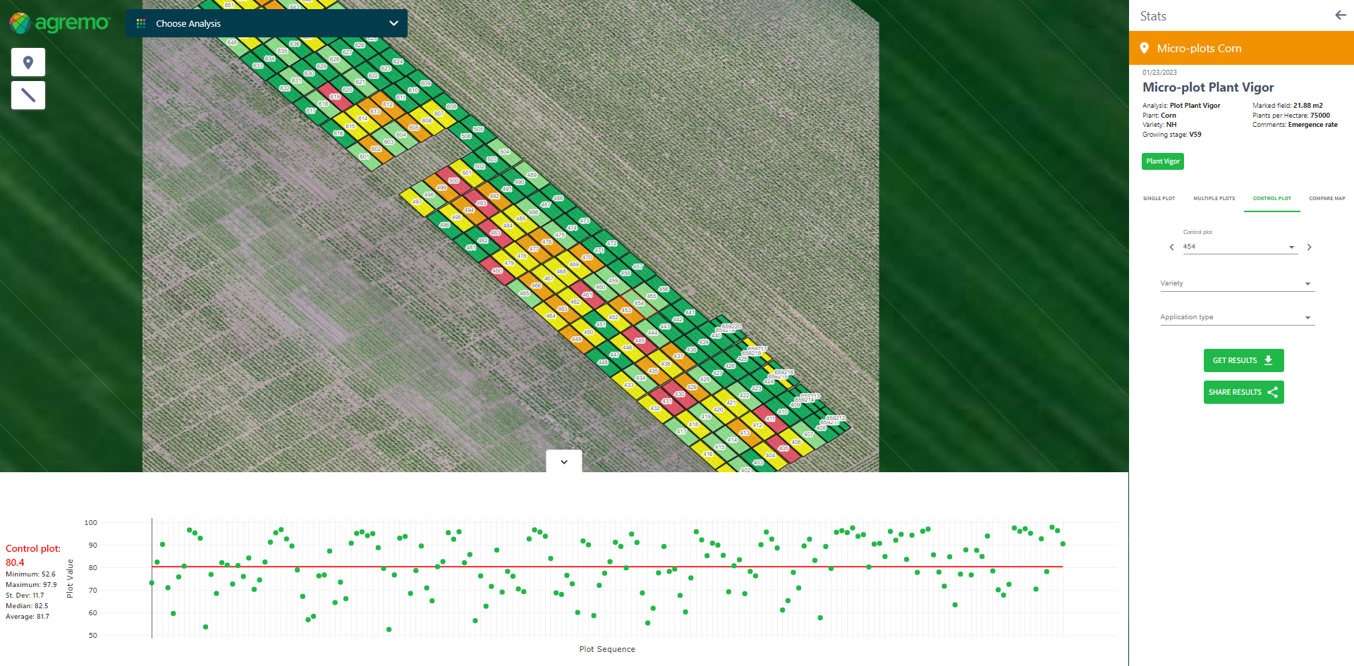
Control Plot View
Steps to Reproduce
- Click on the “Control Plot View”.
- Control plot, Variety, and Application type are visible on the Stats panel.
- On the Bottom line Stats, Statistical data and Point charts are displayed.
- The point chart has two values:
- X-axis: Plot Sequence.
- Y-axis: Plot Value.
- Select a Control plot from the drop-down list.
- The control plot is selected on the map.
- The value of the Control plot is displayed above the statistical data.
- The result of the Control plot is displayed as a red line on the Point chart.
Rules
Control plot, Variety, and Application type are empty by default. Ensure the control plot includes Agremo analysis results for comparison with results from other plots. When you select values from the drop-down lists, the system updates the results on the map and Bottom line Stats accordingly. Each point represents one plot. When you hover over a point, the system displays a tooltip. The tooltip shows the Plot ID, the value obtained from Agremo results, Variety, and Application type. Clicking on a point zooms in on the selected plot. Clicking on a plot prompts a message to confirm if it is a Control plot. Confirming this displays the plot’s values as a Control plot. Clicking the middle arrow lets you raise or lower the Bottom line Stats.
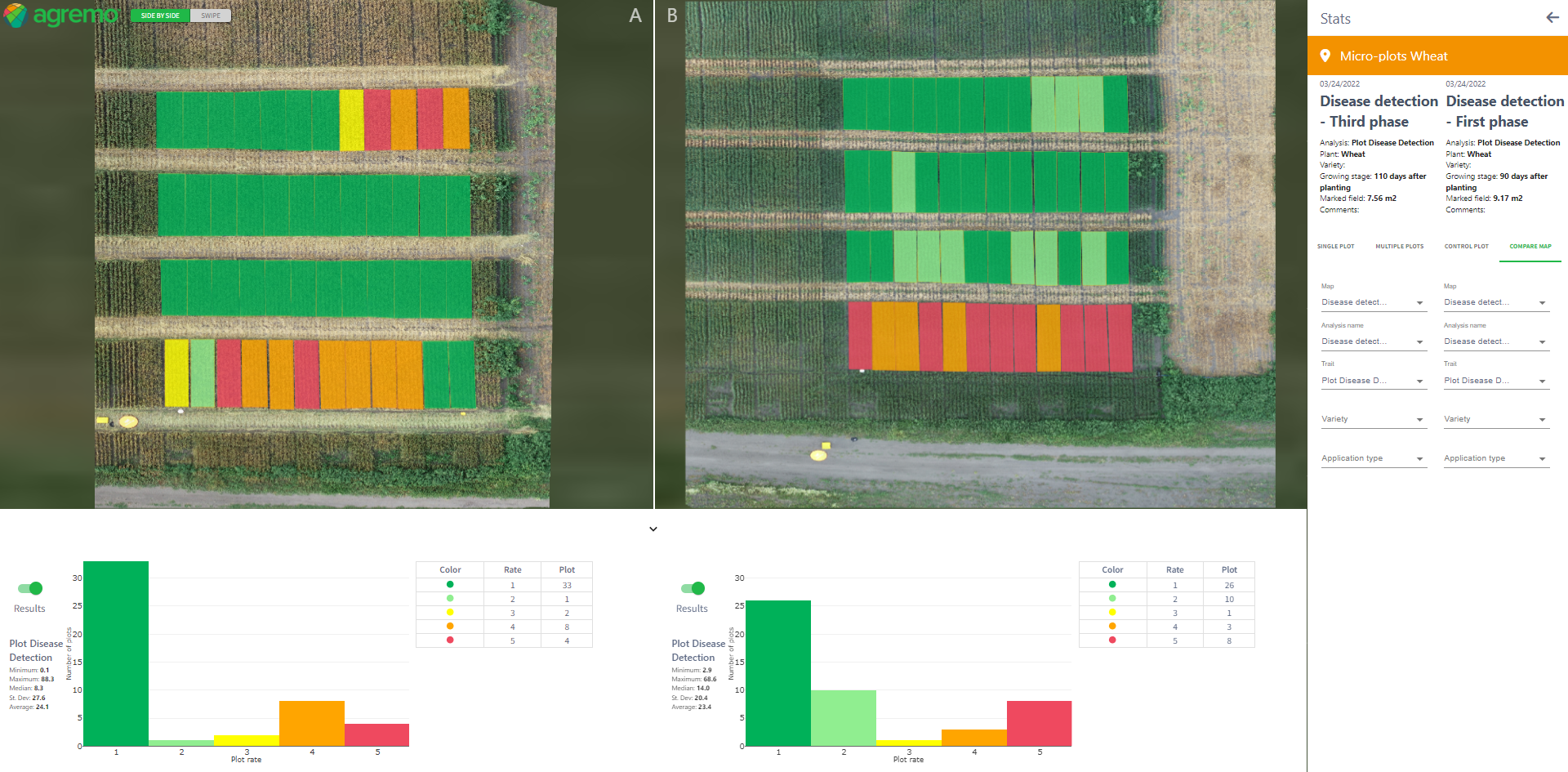
Compare Map Tool
Steps to Reproduce:
- Click on the “Compare Map” tab (image 29_1).
- The trait that was included, along with information about the name of the map, analysis, and trait, will be automatically filled in on the Stats bar (left side). The results for the selected trait will be displayed on the map and the lower part of the screen.
- On the right side, the filters will be empty by default. The left map will show the Worldwide map (map from the Home page) as the right one but without results and annotations. The bottom part of the screen will be empty (the histogram box will be visible).
- Enter all mandatory data on the right side.
- Automatically, the results should be visible on the map, and a histogram with the results should be displayed in the lower part of the screen.
Rules:
- On the Stats panel, you will see the following:
- Information about the analysis .
- Filters: Map (mandatory), Analysis name (Mandatory), Trait (Mandatory), Variety (optional), Application type (optional)
- The Filter Trait will be visible only for traits with the “Finished” status.
- The system will apply all selected filters to the map and the lower part of the screen (statistics, column chart, and legend).
On the map, you will see:
- Buttons: “Side by Side” (by default) and “Swipe”.
- Labels A and B
- If you select maps from two different geolocations, you can display the results with the “Side by Side” option. If you click the “Swipe” button, a notification message will appear: “Info! You have chosen 2 maps with different geolocations. To use the Swipe option to compare maps, please select maps with the same geolocation.”
On the bottom line, you will see:
- Two column charts, separately for each map.
- X-axis: scores that are set on the Rate plot.
- Y-axis: number of plots that have that rating.
- A legend with columns: Color, Rate, and Plot.
- Statistical results for each selected Trait (results for all plots on the map).
- A button for turning on/off results on the map
Navigation:
- When you click on the “Compare Map” tab, the system will display the trait that was selected on that tab on the left side of the Compare Map tool.
- If you select data for the right side as well, then change the tab, and then return to the Compare Map tool, all previously selected parameters will remain.
- If you select another trait and then go to the Compare Map tool, only the left side will be filled as default, while the right side will be empty.
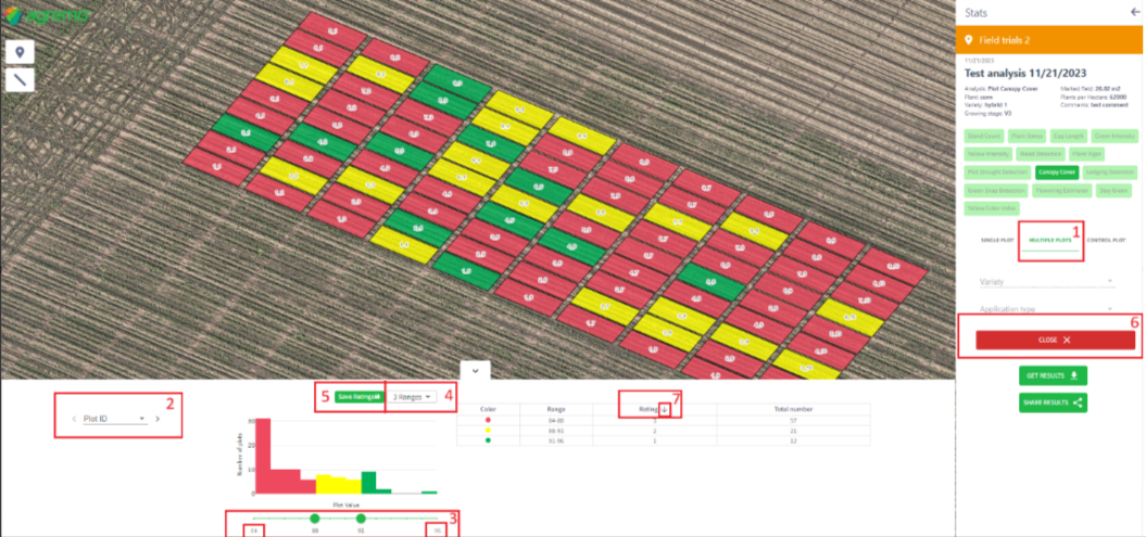
Rate Trait
Steps to Reproduce
- Click on “Multiple plots”
- Click on the “Rate” button, displayed on the Stats panel.
- The “Rate” button is visible on the Stats panel.
- The “Rate” button (edit (pen) icon) is visible on the table, next to the label “Rating.”
- Choose “Plot ID” from the drop-down list
- Edit the slider on the histogram
- Choose the proper “Range”
- Choose the appropriate order of grades in the table
- Based on the chosen parameters, the table should be updated.
- Click on the “Save” button.
- A new modal with a question appears: “Save ratings.”
- Click on the “Yes” button.
- A success message appears: “Success! Successfully rated.”
- Click on the “Close” button.
- Values are saved and visible on the Bottom line Stats.
- Rates are visible on the XLS report.
Rules
- When you click the “Rate” button, the button turns red and serves to close the plot rating option. Clicking the “Rate” button also disables “Variety” and “Application type.” Additionally, the following appear on the Bottom line Stats:
- “Plot ID” field, which is empty by default.
- Values for the selected plot.
- Histogram with two values:
- X-axis: Plot Value.
- Y-axis: Number of plots.
- The histogram slider, which shows the min and max values based on the obtained Agremo results.
- A drop-down list with Ranges.
- Table with default values in the “Rate” column based on values from the histogram.
- A rate inversion arrow in the “Rate” column, allowing you to set whether the ratings will be displayed from the smallest to the largest or vice versa.
- A “Save” button. When the “Save” button is clicked and then the “Get Results” button is clicked, a new “Rate” column will be created in XLS for each trait on which the “Save” button is clicked.
- A new column will be in front of the results of that trait.
Client Satisfaction – Evaluation Analysis
Rules:
When you exit the Results panel, the system will display a modal for you to evaluate all the traits you have sent up to that point. If you rate only 1 of the 5 traits displayed on the modal, the next time you exit the Results panel, the system will display a modal with 4 traits for you to rate. If you click the “No, thanks” button, the system will not display that modal again. If you click the “X” button, the system will display the modal again later, depending on the settings in the parameter table, initially set to 1 hour.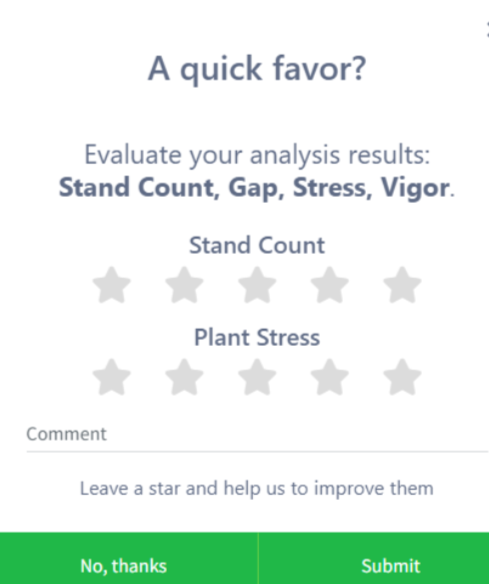
Exporting Plot Analysis Result
General Rules for XLS Files:
- One XLS file will be created for all requested traits.
- The XLS file contains the following data: Row number, Field name, Map name, Map date, Analysis name, Plot ID, External Code, Crop, Variety, Application type, Growing stage, Analyzed area, Area unit, and all results for the requested analysis, including Vegetation Indices Metrics.
- The XLS file for plot results is visible only in this section. On the Analysis History page, XLS plot results will not be displayed; a different type of plot report is used there.
- Part of this XLS file is on the picture below

Get Results:
- Open the map.
- Click on the “Stats” button.
- Choose the analysis result.
- By default, the “Multiple Plots” tab will be opened.
- Click on the “Get Result” button.
- The output is a zip file containing one XLS report for all requested traits and an SHP file for each trait.
Note: You will get SHP results within annotations, such as polygons, rather than in the same format as regular annotations (points, lines, etc.).
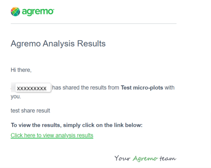
Share Results:
- Open the map.
- Click on the “Stats” button.
- Choose the analysis result.
- By default, the “Multiple Plots” tab will be opened.
- Click on the “Share Results” button.
- A new modal appears.
- Enter the email (mandatory) and comment (optional field).
- Click on the “Share via Email” button.
- A message appears: “Info! Analysis results were sent successfully!”
- The user receives an email notification with a link to download the zip file containing the XLS report and SHP file.
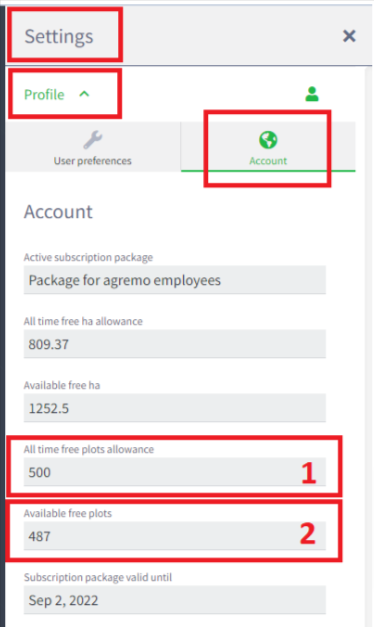
Reviewing the Remaining Plots Within the Package
Steps to Review Remaining Plots:
- Click on the “Settings” button.
- Click on the “Profile” label.
- Click on the “Account” tab.
- The account page appears.
- “All-time Free Plots Allowance” displays the total number of plots allowed in the package (1).
- “Available Free Plots” displays the number of plots remaining (2).
- Users can also see how many plots have been analyzed for each analysis.
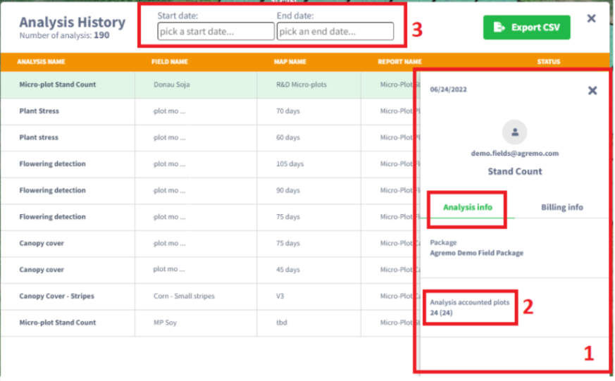
Steps to Review Analysis History
- Click on the “Settings” button.
- Click on the “Profile” label.
- Click on the “Account” tab.
- The Account page appears.
- Click on “Analysis History.” The Analysis History modal appears.
- Click on the “i” sign on the right side of the analysis.
- A new modal appears with Analysis info ).
- The label “Analysis Accounted Plots” displays the number of analyzed plots (2).
- To review analyses for a specific period, enter the Start and End dates and click on the “Export CSV” button (3).
Experience the power of comprehensive plot analysis and management
Sign up now and take the first step towards smarter, more efficient farming.
